
Today is the main screen, the first one that appears when you open the app. At a glance it says who is in charge, which doses need giving, which appointments and tasks are due, and it carries the button for noting down new things. It’s where you’ll spend most of your time.
The header
At the top is the name of the active group, so that you can confirm you’re in the right place, and just below it a greeting with your name. If you care within several groups, tap the group name to move from one to another.
On the right, always visible, the SOS button , the quick way into the emergency screen — it’s there so that you don’t have to hunt for it in a rush. You have it in the SOS guide.
The turn: who is in charge
Below the greeting is the turn banner, the strip that says which caregiver is in charge right now. It’s there so that nobody assumes that «someone else will see to it» and no dose is left in no man’s land.
See who has the turn
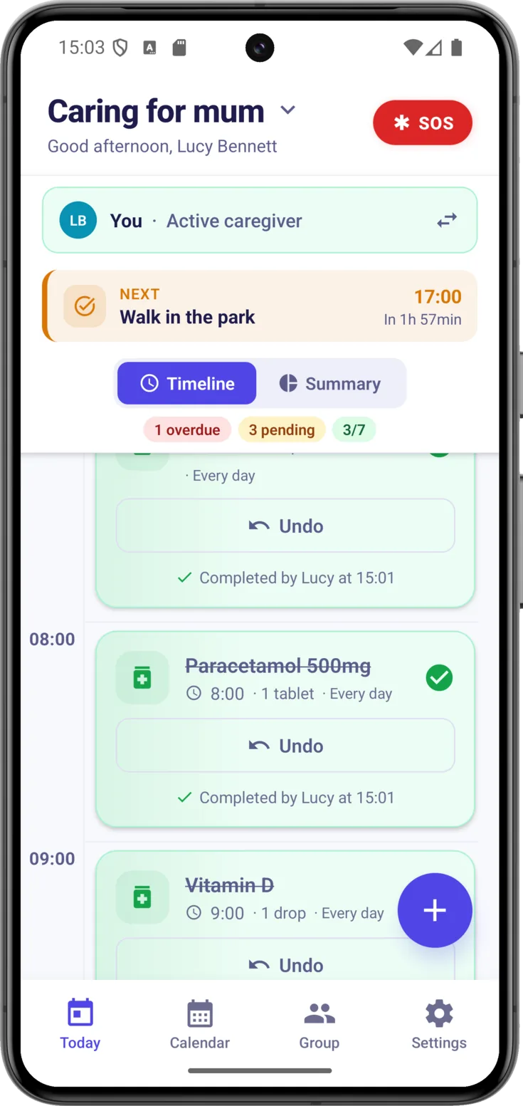
- If it’s you: «You» with the «Active caregiver» label on a green background.
- If it’s someone else: their name next to their avatar, that coloured circle with their initials, so that you know who to tell.
- If nobody has it: «No turn assigned» on an amber background. It isn’t a problem, it’s a reminder that it would be a good idea for someone to take over.
Pass or take the turn
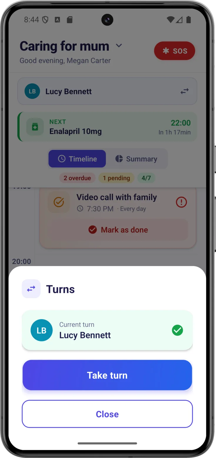
When you start keeping watch, or when you leave it to someone else, tap the banner . «Turns» opens, which says who has it now and is where the turn is passed on or taken —in the picture, with the «Take turn» button—. It can always be changed again.
That way there’s a record of who took charge at each moment, with no arguments along the lines of «I thought you were on». Step by step in Turns.
What’s next and the state of the day
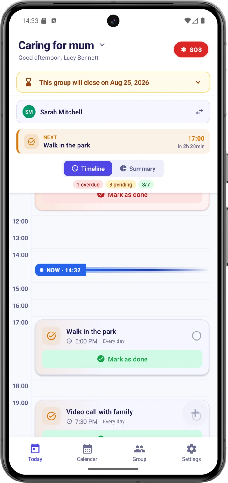
If something is due later on, the «Next» notice appears with the next dose, appointment or task and how long there is to go —«In 25 min»—, so that you’re ready in time.
Below it, a few status chips sum the day up in three figures: in red, what’s overdue, that is, whatever went past its time without anyone marking it; in amber, what’s still pending; and in green, how many things have been completed out of the day’s total —«1/4», for example—.
Seeing something in red doesn’t mean that anything serious has happened. Very often the medication was given and what was missing was the marking, so the thing to do is check and, if it was done, mark it.
Timeline or Summary
Choose how to view the day
With the selector at the top you switch between the two views whenever you like:
- «Timeline» — the hours of the day that have something in them, in order, with a «NOW · 16:35» line marking where you are. Empty hours aren’t drawn. It’s the «what’s due now and what comes next?» view.
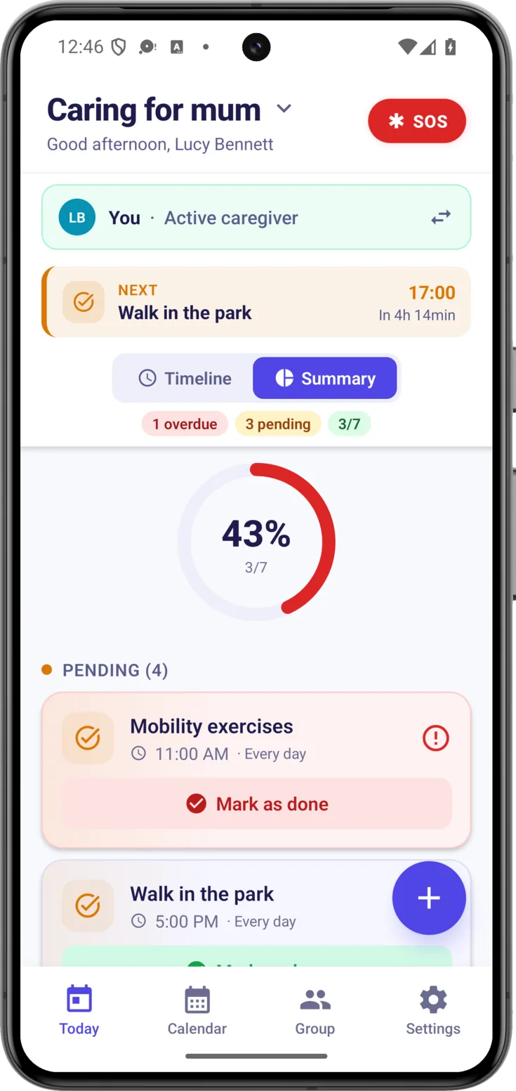
- «Summary» — a ring with the percentage completed and two lists: what’s pending and what’s done. It’s the overall view.
The day’s timeline
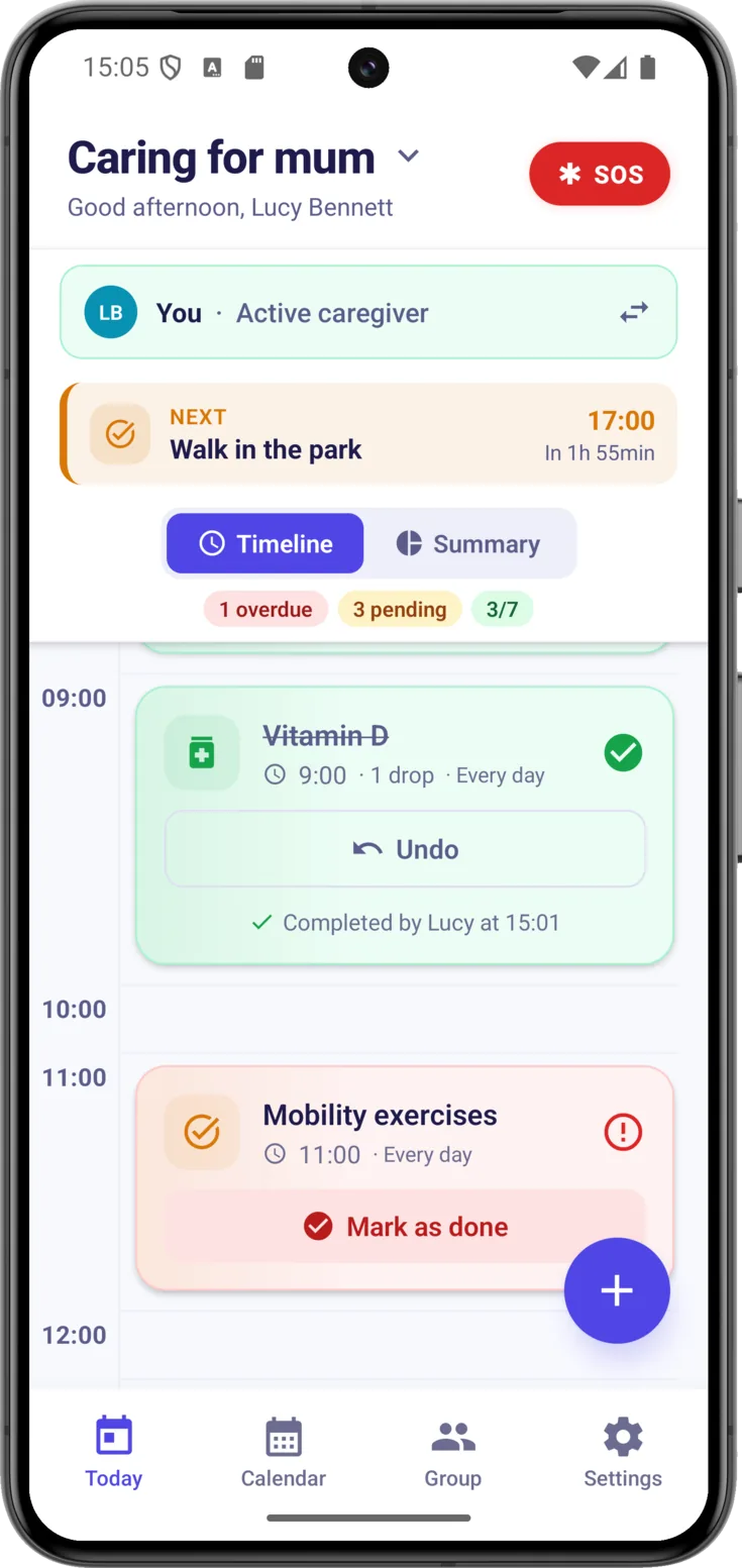
In Timeline, every dose, appointment or task —the three things the app calls routines— is a card placed at its time, with its icon according to type, the title, the time and its status:
- Pending — still to be done.
- Happening now — it’s what’s due at this moment.
- Completed — already done.
- Overdue — its time went by without it being marked.
Mark something as done
Every time you give a medication or finish a task, tap «Mark as done» on its card. It’s the most important gesture of the day to day: it’s what keeps the group informed without anyone reporting in over the phone.
If you slip up, «Undo» puts it back to pending. And every mark is recorded with who and at what time, in view of everyone, so another caregiver who comes on later knows that the dose has already been given and doesn’t repeat it.
If you can't see the button, the cards are in Compact
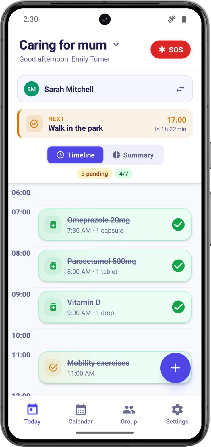
Can’t see «Mark as done»? The most usual reason is that you have the cards in Compact, as in the picture: each dose, appointment or task takes up a single line —name, time and dose— so that many more of them fit.
There you mark it by tapping the circle on the right, which also tells you how each thing is going: an empty circle means pending, a green tick done, and a red exclamation mark past its time.
You change it in Settings → Preferences → «Schedule», and take care not to mix it up: that setting decides the size of the cards, not whether you see Timeline or Summary. Compact works well when there are a lot of things each day; Expanded, if you’d rather see it all written out.
If you’re on the Expanded view and the button still doesn’t appear, then it isn’t a matter of views but of permissions, and we explain that a few lines further down.
Open the detail
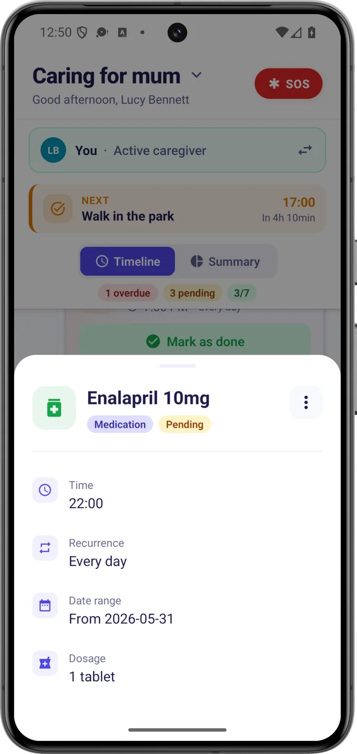
To see the full set of times, the notes somebody left or the photo of the medication, tap the body of the card —not the marking button— and its detail opens. From there you can also edit it, according to the permissions you have.
Adding things (and scanning with AI)
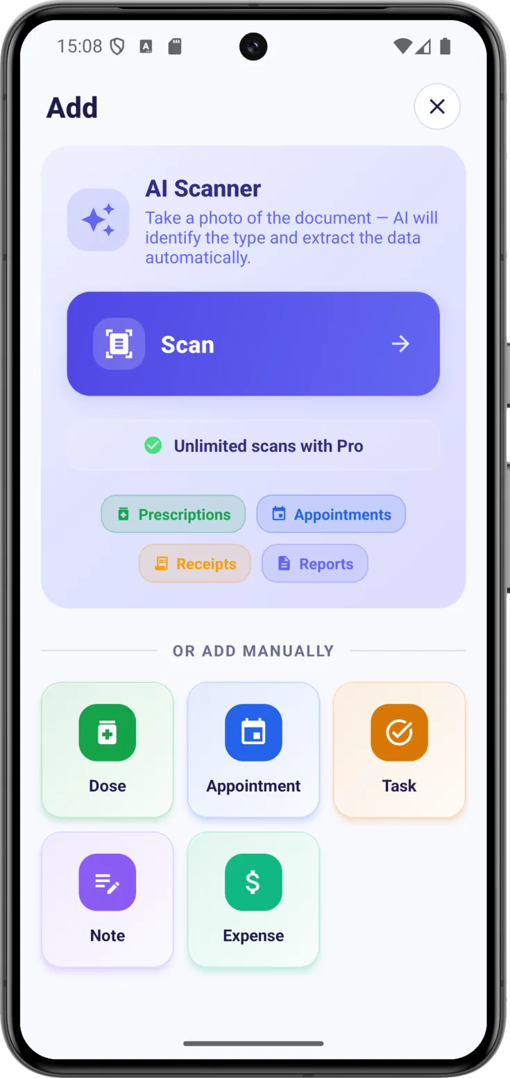
The button at the bottom right opens «Add», from where anything at all gets recorded. There’s no need to know where each type goes: everything starts there.
Scan a document with AI
If what you want to note down is there on paper, tap «Scan» , take a photo of it and artificial intelligence recognises what it is and fills in the details. It recognises prescriptions, appointments, receipts and reports. In full in Scan with AI.
Or add manually
Below, under the heading «Or add manually», there is one card for each type: «Dose», «Appointment», «Task», «Note» and «Expense».
The «Dose» is a medication, the «Appointment» a medical visit and the «Task», the care that is neither of the two: washing and dressing, a meal, a walk. The «Note» is for leaving something in writing for the rest of the group, and the «Expense», for keeping the accounts.
You may not see them all: only the ones your role can create show up. Each form is explained in its own guide: Routines for doses, appointments and tasks, Notes and Expenses.
The notices at the top
Above the timeline some notices can appear, and they don’t all say the same thing. It is worth telling them apart, because what you can carry on doing depends on which one it is.
The amber strip of the closure
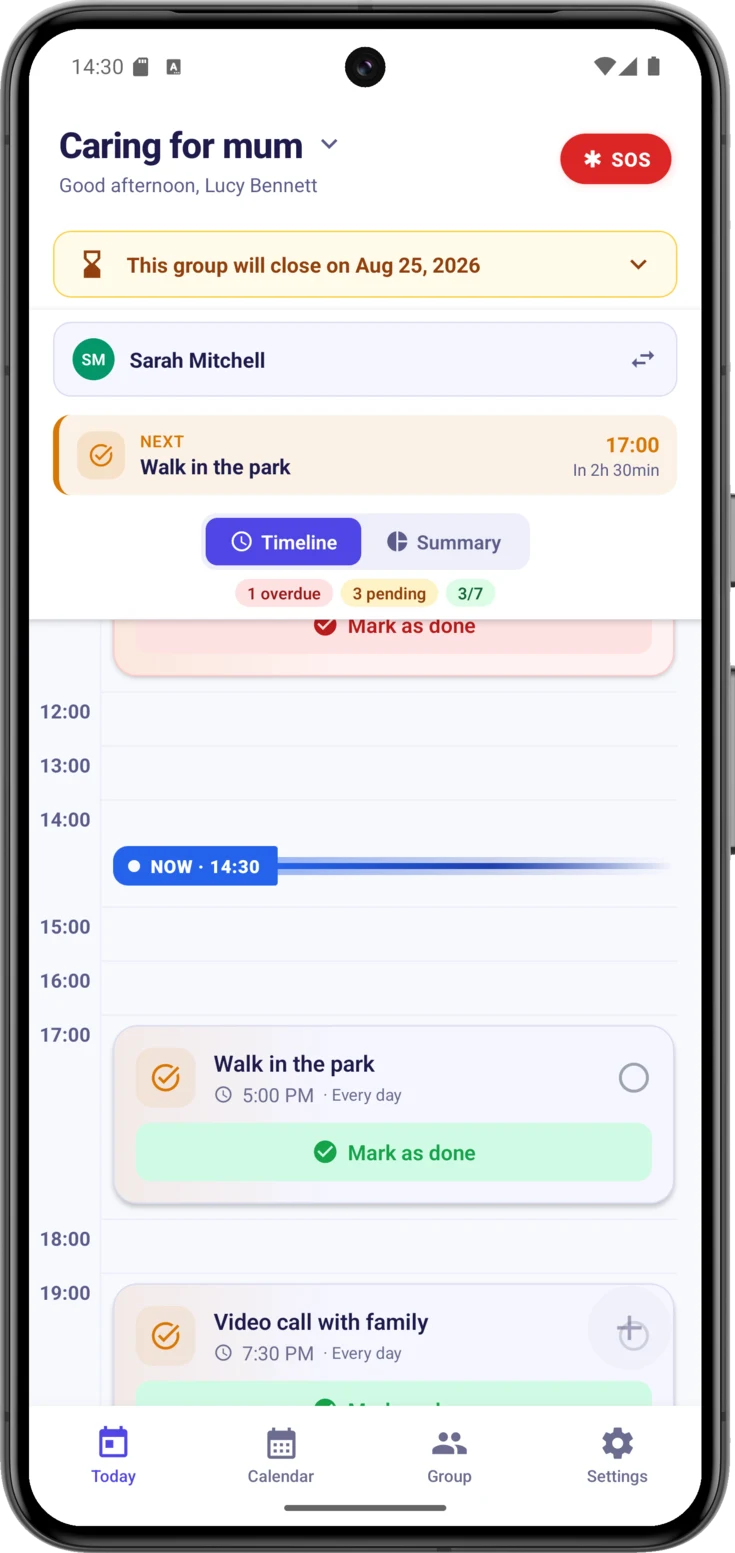
One of them is the amber strip: the group has a closing date. It arrives collapsed, on a single line with the day on which it will close, and tapping it opens it out and explains where the decision comes from. If you organize the group, it says that you were the one who scheduled it and that you can cancel it; if you don’t, it says that whoever organizes it has decided and how long the period runs for.
The picture shows at a glance what is most confusing about this situation. The two morning doses are marked as done, in green and with their «Undo» available in case there was a mistake, and the counter at the top is at 4 out of 7; the turn has been passed on as normal. Meanwhile, the button at the bottom right is switched off. The day’s care carries on exactly the same; what stops is creating new things.
Opened out, if you don't organize the group
This is how the notice reads when the decision wasn’t yours. It says who took it —without naming anybody—, what can still be done until the date and what cannot, and it reminds you to save a copy of whatever you need beforehand. It carries no cancel button, because withdrawing the closure can only be done by whoever organizes the group.
Notice that the turn and the timeline carry on exactly the same below: things can be marked, the turn can be taken, and the reminders keep on arriving.
When you are taken out of a group
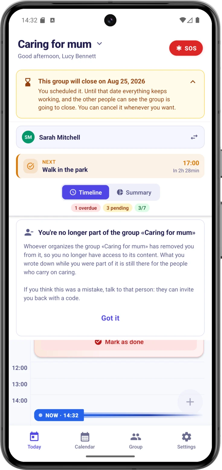
This is the card that appears if whoever organizes a group takes you out of it. It comes up over the timeline, with the app open, without you having to close it and come back: it says the name of the group, explains that you no longer have access to its content, reminds you that what you wrote down stays there for the people who carry on caring, and points to the way out if it was a mistake —that this person invites you again with a code—. It goes away with «Got it».
When there is nothing
Sometimes you’ll open the screen and there will be no cards. It happens in two situations, and each one says so:
- A newly created group: «Start organizing care» and a hint «Tap the + button below». It’s the normal starting point.
- Nothing due today: the group already has routines, but none of them falls on today. «No pending tasks» and «All done!» appear.
And do watch out for one easy mix-up: completing everything for the day doesn’t empty the screen. The cards are still there, in green and crossed out, which is what you want — being able to see that it’s done. The celebration for a day that went perfectly is in the Summary view, when the ring reaches 100%.